Fixing colour contrast without losing your brand colours
Contrast failures tend to sit in the most polished parts of a design: pale grey captions, bright orange buttons, barely visible input borders. You do not need a new brand colour, just a different way of using it.
In our test of 20 EU storefronts, low contrast was the only issue every store had. It does not only affect people with low vision: anyone on a phone outdoors, with the brightness turned down, or with ageing eyes struggles with pale text.
What WCAG requires
| Content | Minimum ratio | Criterion |
|---|---|---|
| Body text | 4.5:1 | 1.4.3 (AA) |
| Large text: about 24px, or about 18.7px bold | 3:1 | 1.4.3 (AA) |
| Button and input boundaries, icons and graphics | 3:1 | 1.4.11 (AA) |
| Logos, disabled controls | No requirement | Exceptions in 1.4.3 |
Contrast is calculated from the relative luminance of the two colours, from 1:1 (identical) to 21:1 (black on white). Every value in the figures below comes from the WCAG formula.
A brand colour on white
Take a typical bright orange, #FF7A00. On white it reaches only 2.61:1, failing for body text and small text:
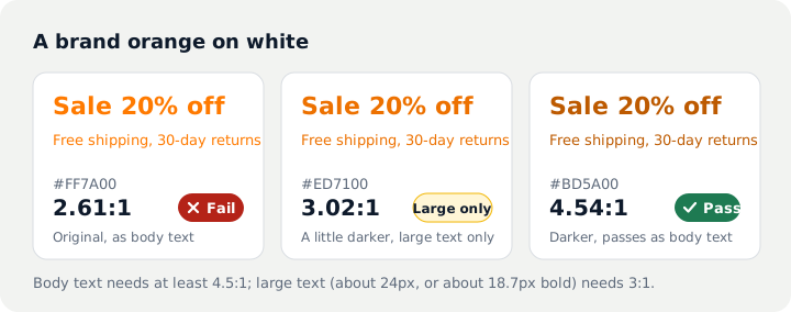
Split the brand colour into two tones: keep the original for headlines, colour blocks and backgrounds where 4.5:1 does not apply, and use the darker tone for body text, prices and links. The page looks almost unchanged.
Buttons
White text on a bright orange button has the same problem: 2.61:1. Two fixes keep the orange:
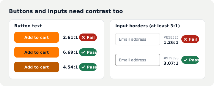
- Keep the button colour and switch to dark text: 6.69:1.
- Keep white text and darken the button: 4.54:1.
Grey secondary text
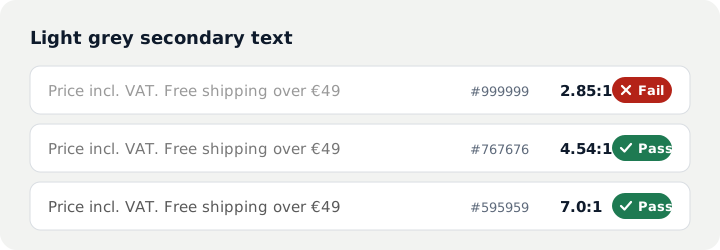
"Incl. VAT", shipping notes and review counts are often pale grey. #999999 on white is only 2.85:1; #767676 is the lightest grey that passes on white (4.54:1):
Inputs and icons
Input borders, checkboxes and icon buttons fall under 1.4.11 Non-text Contrast and need 3:1. Many themes use a border like #E5E5E5, only 1.26:1 on white, so shoppers cannot see where the field is. A tone like #939393 (3.07:1) is enough. Focus rings need sufficient contrast against the background too.
Making the change in your theme
- List the text and background colour pairs your store actually uses and check each one. Our online test lists failing elements directly.
- Adjust the colour schemes under Theme settings → Colors in the Shopify theme editor, or the CSS variables in the theme code if the setting is missing.
- Start with components that repeat everywhere: buttons, prices, links.
- Test again to confirm the contrast issues are gone.
Other checks are in the WCAG 2.1 AA checklist.
Questions
Does our logo need to change?
No. WCAG 1.4.3 exempts logos and text in brand names, and disabled controls are also exempt.
Does text in banner images count?
Yes. Text in images must meet contrast too. Add a dark backing behind the text, or take the text out of the image and set it as live text.
How do I find the failing colours on my site?
Our online test lists elements with low contrast. For a single pair, the contrast hint in browser developer tools is enough.
Sources
- W3C: Web Content Accessibility Guidelines (WCAG) 2.1
- W3C WAI: Understanding Success Criterion 1.4.3 Contrast (Minimum)
- W3C WAI: Understanding Success Criterion 1.4.11 Non-text Contrast
This article summarises technical requirements and public data. It is not legal advice; for legal obligations and lawsuits, consult a qualified attorney.